The goal
Comfyco furniture eCommerce website development
Tasks
- refresh the logo
- existing eCommerce website redesign
- adaptive HTML layout
Project history
We were approached by a client with the task of redesigning an online furniture store for the American market. We were pleased to know that he chose us because in our work we write clean code.
The client himself understands programming, and that is why he was looking for a development team for quite a long time to give his project into reliable hands.
The client provided the terms of reference for the redesign of the online store, but before starting work, we held several conferences to understand how he sees his new online store in detail.
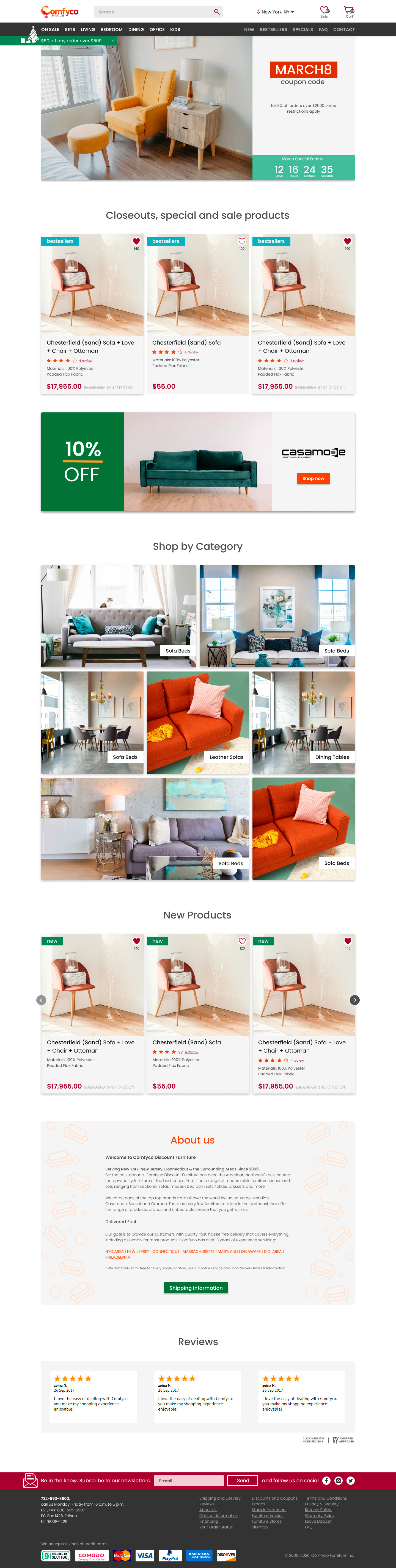
Homepage
After defining the main aspects, our team began to create the main page and developed a concept with several color solutions as part of the terms of reference.


When developing the design, special attention was paid to images, since they represent the product to visitors.
The difficulty was that the images have different sizes and quality since the store presents products from different suppliers.
Based on this, it was decided to use a square shape for product images in order to simplify their scaling and cropping.
Menu
Two menus were developed:
- classic in the site header;
- fixed menu available when scrolling the page.
Also in a fixed block, we left the key navigation elements – search and cart.
Category page
On this page, quite a few elements have been developed that allow the client to interact with the products on the page, as well as choose the one that he needs.
The category itself looks like this:
- promo banner with category name;
- filter;
- tile with goods;
- category description;
- block with recently viewed products.
Product card blocks look different than on the main page, because, unlike categories, it is designed to attract attention, while the category page is more informative and contains additional photos that change on hover, which gives the site interactivity and convenience.


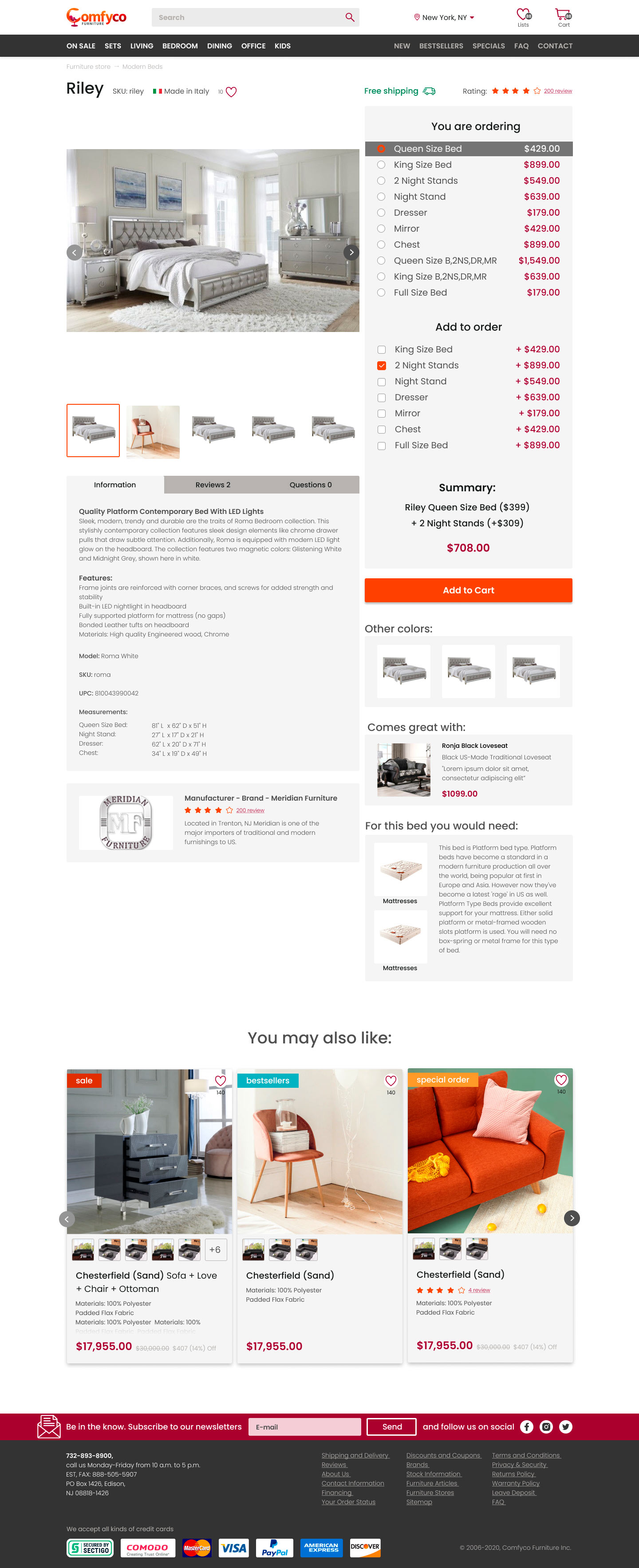
Product page
One of the most difficult elements in this project is the product page because by clicking on a specific product, the user can immediately buy related products.
It was decided to make the area for the main image of the product square for the optimal display of images of different sizes and aspect ratios, and to fix the sidebar on the screen, if possible.
Most of the products in the image form sets that are in harmony with each other. This is not only very convenient for the user because he can choose both a bed and a bedside table that matches it but also helps to increase the average bill.
In addition, additional blocks have been developed that inspire confidence and encourage the user to make a purchase or start interacting with the site, for example:
- product reviews;
- the ability to ask a question about the product.
Answers to questions are available to all users, which allows not only increases the credibility of this particular product but also expands the base of questions from customers with whom you can work, thereby improving the product.
Also, especially for this page, we have developed a system of banners that notify the user about discounts available on the site and provide information about current coupons.
Product page with options
Cart page
The cart is designed in such a way that the user does not spend a lot of time filling it, since the whole process is broken down into small steps that are visually easier for the user to perceive.
An important point. In the shopping cart, it was decided to remove the main menu so as not to distract the user from the checkout process.
In the shopping cart, the user chooses a delivery method convenient for him, additional delivery services, and the process of filling the shopping cart is displayed on the timeline above, which also displays the current cost of the order at certain stages.
Delivery page
Since this online store operates throughout the United States, shipping costs may vary significantly from state to state. Therefore, we have developed a separate page that would allow the user to select their state and find out the exact cost of delivery, as well as its approximate time.
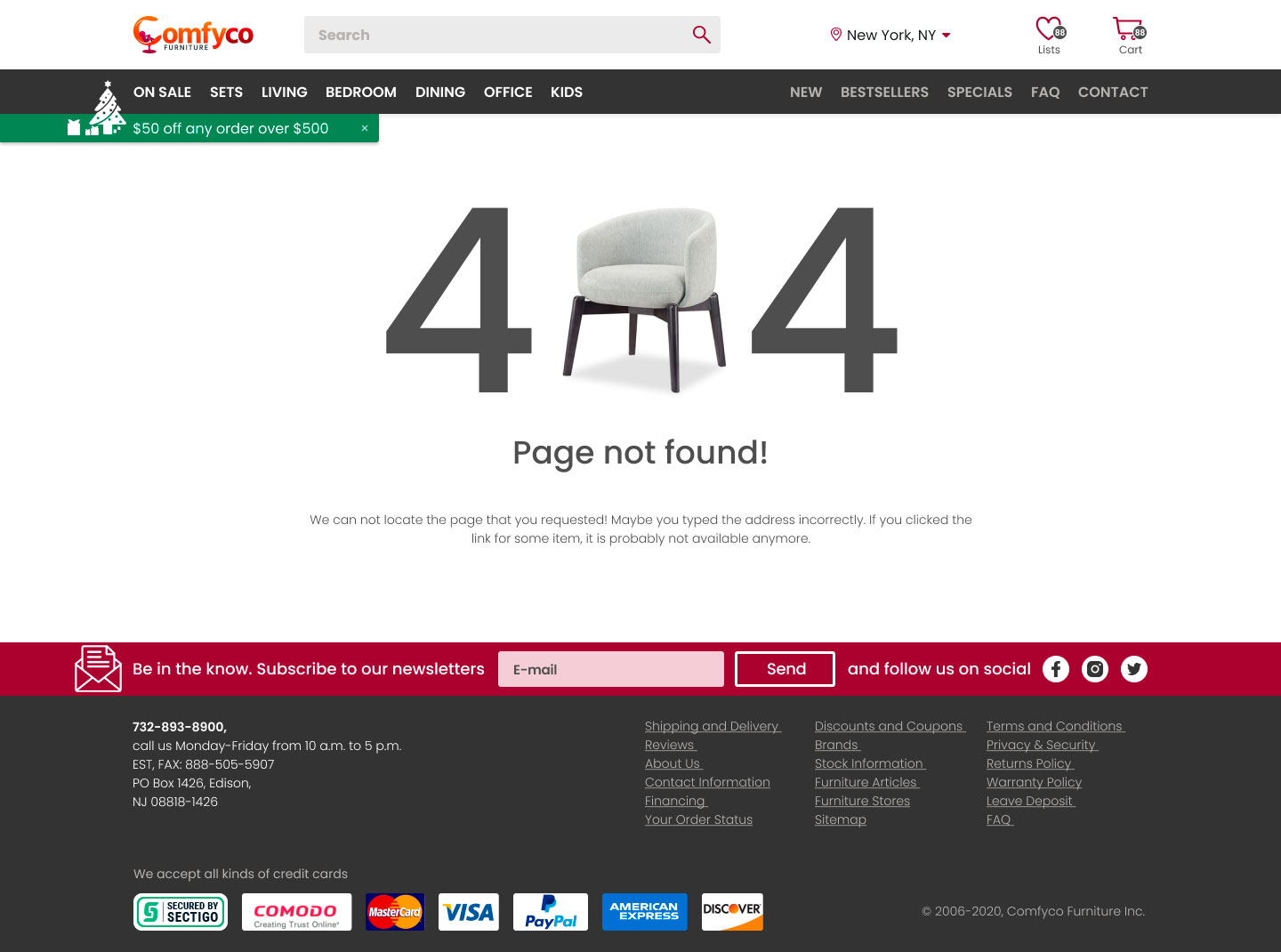
404 error page
Mobile version
When developing the mobile version, we faced the following challenges:
- menu reorganization;
- handy filter;
- search, which would repeat the functionality of the main version of the site;
- handy footer;
- develop several types of product display;
Homepage
We tried to preserve as much as possible all the functionality of the full version of the site, we made sure that all advertising windows were preserved. All blocks of the main page for mobile user UX were redesigned, which made it possible to reduce the length of the mobile version of the page.
We have changed the footer to make it convenient for the user to click on links by implementing the menu as a set of buttons. These are very important changes because some pages can only be accessed from this part of the site.
Filter
Sometimes developers neglect the filter on the mobile version by hiding it altogether. In our case, we implemented it in a separate pop-up window with full functionality.
Category
For the mobile category page, we have developed two options for displaying products:
- compact – in this case, two products are placed on the screen of the device, which makes it easier to familiarize yourself with the assortment;
- advanced – displays one product per line, and allows you to view the images in more detail.


Discuss a project